
How to prototype a Facebook Messenger bot with Keynote.
 Published on
in
Tutorial
Published on
in
Tutorial
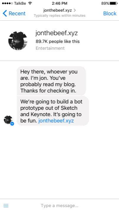
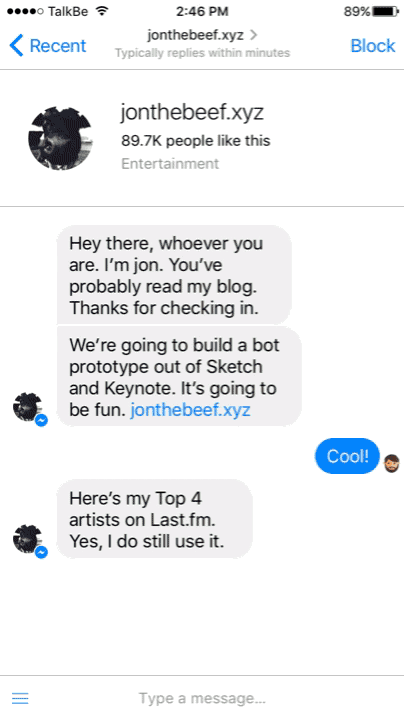
Recently, I was asked by my pals at TalkBe to help them prototype an example of how a bot could work for a brand they work with in Facebook Messenger. There’s a few UI kits kicking around, and so they thought I’d be able to use one to showcase a conversation a typical user could have with the bot, and specific commercial actions that could be taken.
Here’s the problem; How can we showcase this conversation in the most easy to understand way? As this was essentially a pitch piece, how could we impress the client, while getting around the typical build time issues, and then put it into the best format so the client could see the idea we’ve had?
The conversation is the experience
This wasn’t a typical prototype or UX piece. The task here was to establish a conversational flow, and then bring it to life using many pieces of the preset UI Messenger already employs. Yes, we could attempt to own some visual flair with the content we would be presenting, but the main parts of the overall experience is how the user can develop a relationship with the bot, and deal with many of their common interactions with the brand through the interface.
Copy is often the most important part of both UX and digital service design, as it’s the persuasive element which can convince a user to transact, or signpost their way to another area of service. For IM, copy is the only thing you have in converting a user to your goals.
To begin, script your conversational flow either in a text editor, or through a flow charting exercise. Remember to indicate the type of message, and required callbacks/CTAs.
This might be easy for some of you, but the essential bit is to put yourself into both the shoes of the user, and the brand that the bot is representing. Then, have a conversation with yourself! To get the best out of the feature set that Messenger has, you’ll also need to familiarize yourself with the differing types of interface language available.
Let’s look at the different interface elements we’ll be using:
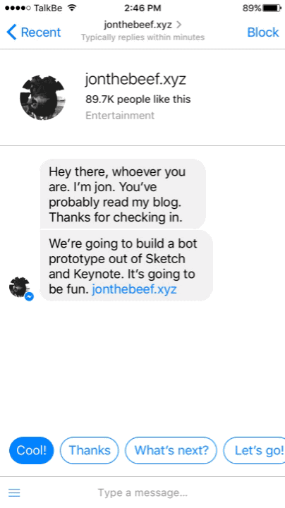
- Comments behave just as you think they will, because they’re the speech bubbles you see between yourself and the bot. They display simple content, without any embellishments, save for URLs. Be aware of their spacing, and how they change when comments are delivered in fast succession.
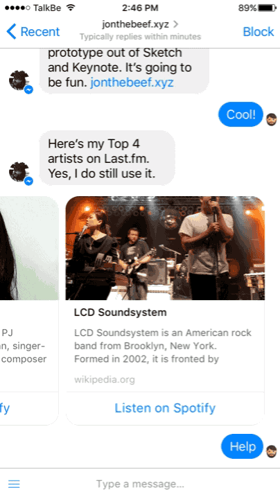
- Structured Messages can contain an image, title, description and calls to action. They might also contain a URL, but the key utility of this message type is to give call backs (CTA buttons) that the user can select to change the onward journey of the experience. They can also be used in a carousel.
- Quick replies appear above the message input, and are designed to be fast answers a user can select without having to type. While these can be generated through machine learning and be relevant to content, they can also be hard curated based on the expected reply instance.
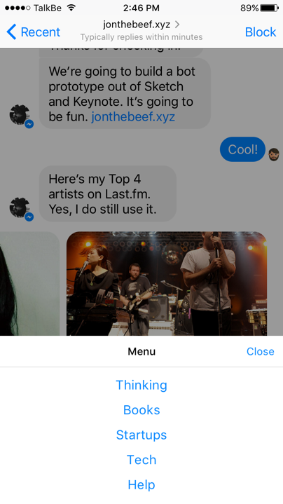
- Persistent menu appears when the burger icon is tapped at the side of the chat input, and gives the option to launch a different function of the bot. So for instance, users can select “help” or “top sellers” as a fast action from the menu.
Prototype!
We’ll assume here that you’re familiar with editing template documents in Sketch. After all, there’s thousands of them out there.
- Bots came out not long after Facebook announced the new APIs for Messenger.
- Sketch App Sources has this rather good mockup which has some good UI examples and demonstration of how the flow can work.
- Facebook have this rather excellent iOS9 UI kit, which contains some bits you might find useful later on. And if you’re reading this in a post iOS 10 world, they’ve probably got a kit for that too.
We’re going to focus on animating assets in Keynote, to demonstrate what a bot experience would be like. In the real world, for your own conversations, you might edit the assets in Sketch and copy them in to Keynote for prototyping. Or redraw the assets in Keynote, so you can edit them there. I’ll leave that one to you though!
Tutorial Assets
I’ve also included the completed Sketch file you can play with as you please.
Step 1 - Setup your Keynote file
Open fb messenger iphone template from the Keynote folder. Select “New document” when prompted.
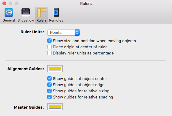
Go to Keynote > Preferences > Rulers.
Select “Show guides at object edges”. The template provided has the necessary guides for all gutter alignments, so selecting this setting will mean the assets snap to the edge of the guides.
Step 2 - Add the first assets
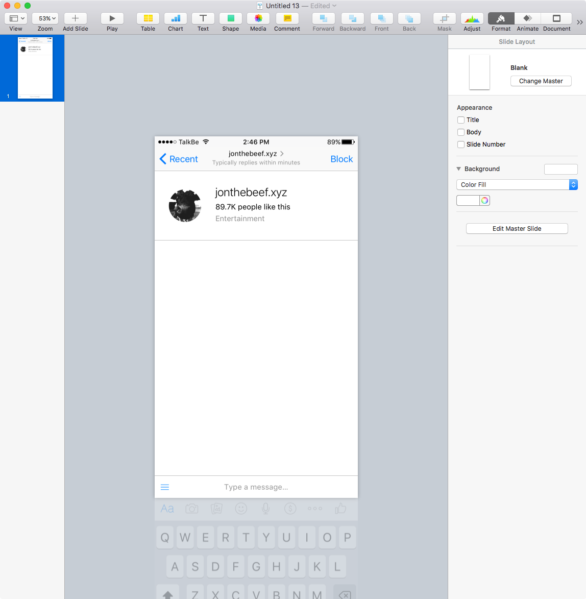
Open the assets folder, and drag in iOS - Nav Bar.png, iOS - Account Title.png, and iOS - Keyboard.png.
Arrange the nav bar so it’s at the top of the screen, with the account title immediately below it.
Position the Keyboard so it’s mainly off the bottom of the slide, leaving only the top “Type a message…” section showing.
Step 3 - Setting up the quick reply
Drag in 01.png from the assets, and position towards the top top left, below the account title.
Now drag in quick reply 1.png and align it to the further most left guide. Position it behind the keyboard by sending the quick reply to back.
Step 4 - Getting your Magic Move freak on
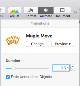
Select the slide, and click “Animate” from above the Inspector. Click “Add an effect”, and select “Magic Move”. Change the duration to 0.3, and ensure “Fade Unmatched Objects” is selected.
Right click on the slide, and select “Duplicate”.
Now, click the quick reply to select it, and move it so roughly 30 pixels above the keyboard.
Go back to the first slide, and click “Play”. You should have something like this.

Step 5 - Simulating a tap
Nice work, you should have simulated quick replies showing for a user to select to continue. Let’s now simulate the user selecting a reply, and adding it to the conversation. This is because Magic Move transitioned the position of quick reply 1 from it’s place on the first slide to the second slide.
Duplicate slide 2.
In the new slide, replace quick reply 1 by dragging in quick reply 2.png from the assets, and deleting it.
Click on slide 2, and change the animation from “Magic Move” to “None”.
Move back to slide 3, select the keyboard, and bring it to front.
Press play. Your animation should look like this now.
Step 6 - Adding replies
Duplicate slide 3, which should still have the Magic Move transition applied.
Move quick reply 2 so it’s behind the keyboard.
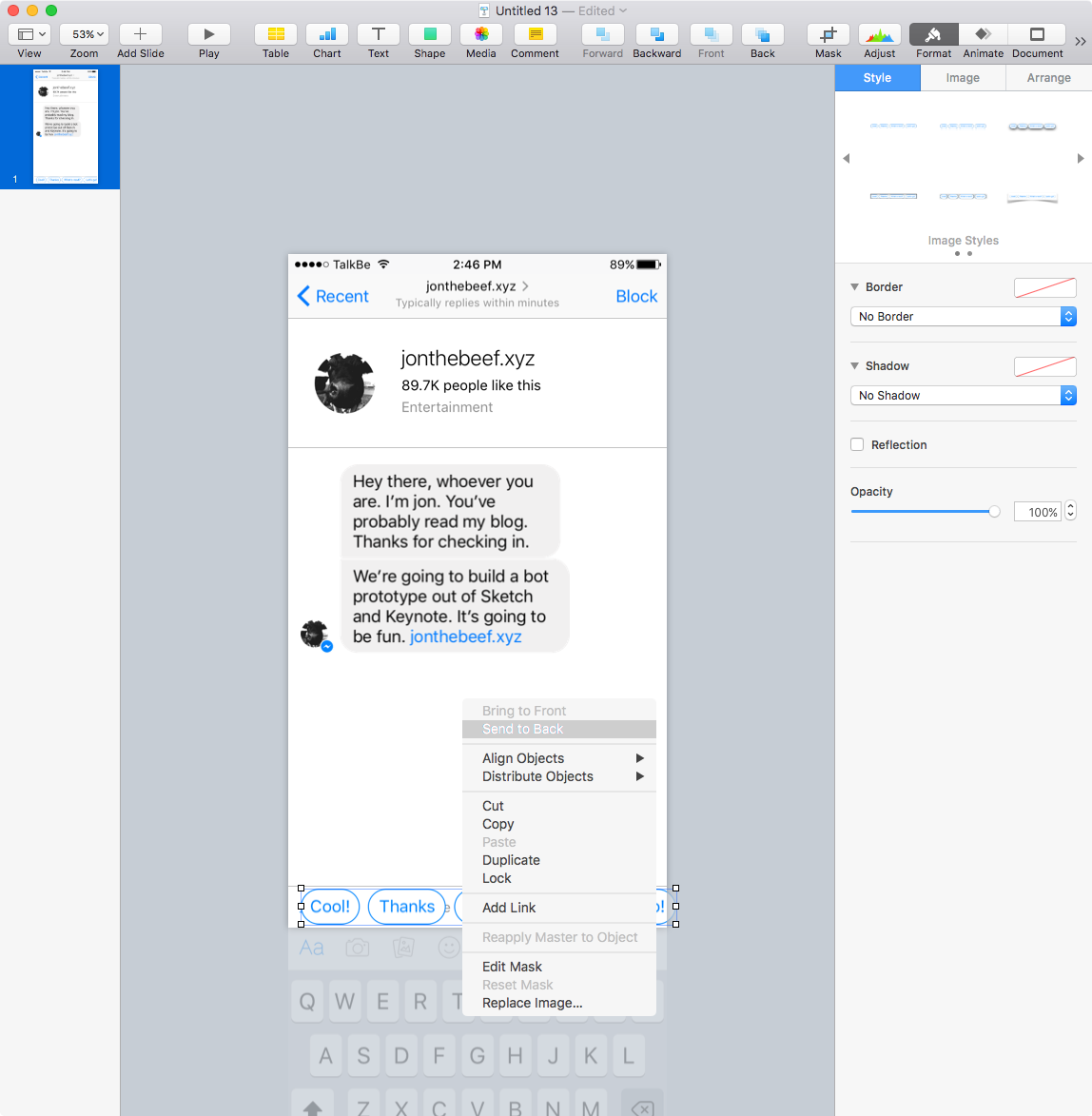
Now duplicate slide 4, and drag in 02.png from the assets. Position it to the furthermost right hand guide, about 20 pixels below the first message.
PRO TIP: Hold down shift and then press the direction you want to move in. Moves the element 10 pixels at a time.
Playing your presentation back now, will show the quick replies move behind the keyboard, and the selected quick reply be added to the conversation.
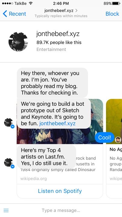
Duplicate slide 5, and add 03.png in on the left hand side, about 20 pixels below the previous comment.
Here’s what you should be seeing.

Step 7 - Structured messages in a carousel
We now need to move everything up, so we can make room for the next element.
Click on the nav bar and bring it to front, then duplicate slide 6.
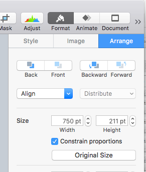
Drag in structured message carousel.png. Be warned now, Keynote does something funky. Whenever you drag in an image, if it’s larger than the slide, it makes it smaller to fit. Nice if you’re designing pitch decks, but rubbish for prototypes. Here’s the fix.
With the carousel element selected, move into the inspector, and click “Arrange”. Then, click the button marked “Original Size”. The image should be now at it’s correct size.
Position the carousel so it’s 30 pixels above the keyboard, and aligned to the secondmost left guide. Send it to back. You’ll see it now behind the previous conversation elements.
Shift-click to select the account title and conversation elements, and them upward so above the carousel by 20 pixels. Because you brought the nav bar to front, the conversation moves up behind them.
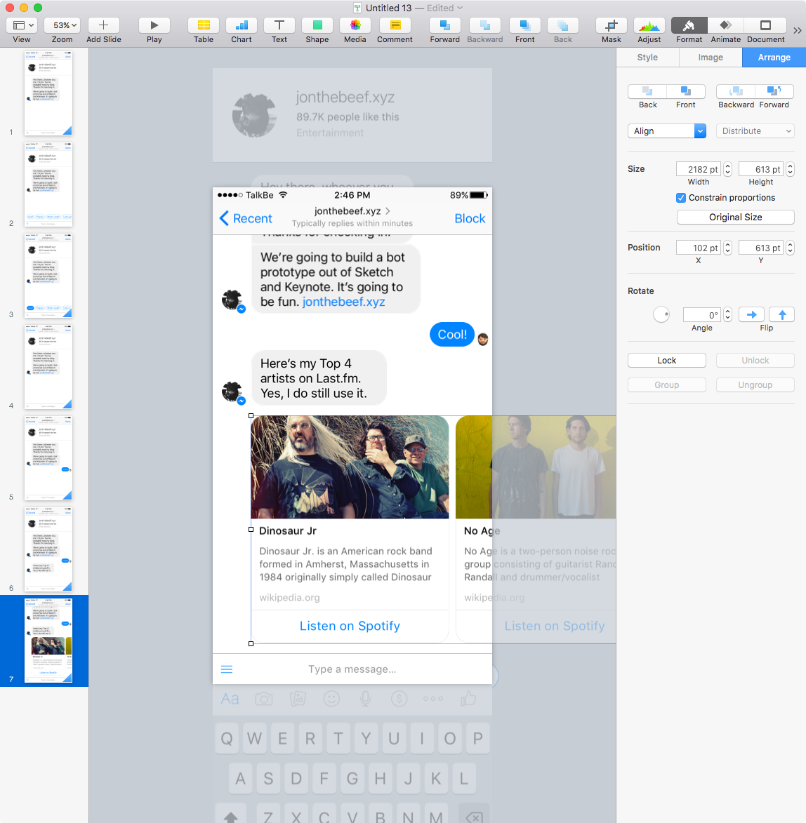
Duplicate slide 7, and move the carousel across so the last cell is in view, and aligned to the secondmost guide on the right.
Press play.
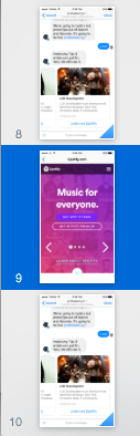
Step 8 - Simulating a webview
Let’s simulate a user pressing “Listen on Spotify”, and being taken into a webview.
Duplicate slide 8, then insert a new blank slide before it. Drag in webview.png. Your slides should now look like this.
Now, select slide 8, and change the transition to “Push”. Set duration to 0.3 and the direction to “Right to left”.
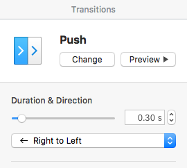
On slide 9, apply a Push transition, also with a duration of 0.3, and set the direction to “Left to Right”.
You should be left with this.
Step 9 - Introducing the menu
We’re now into the final straight, and by now, you should have a pretty good handle on how Magic Move works, and what the outputs look like.
Drag Menu 1.png into slide 10, and position it in front of the keyboard, but off the bottom of the slide.
Duplicate the slide.
In the new slide 11, bring the menu upward so the bottom edge is against the bottom of the slide. We now need to create the alpha transparency that appears.
Draw a box, fill it with black, and drag it so it covers from the bottom edge, to the bottom of the nav bar. Set the opacity to 40%, and remove any borders.
Click on the menu, and bring it to front. Now, drag it upward, so the bottom edge fixes to the bottom of the slide.
Duplicate slide 11, and drag in Menu 2.png. Delete the previous menu, and position in it’s place.
Click on slide 11, click “Animate”, then change Magic Move to “None”.
Duplicate slide 12, delete the opaque box, and move menu 2 downward and off the slide. Duplicate this slide.
Drag in 04.png and align to the right and at the bottom edge of the carousel. Now, select the elements above, and move them upward to accommodate the new message.
It should look like this.
Step 10 - Adding the final replies
Now, it’s the last two interactions before we can head to the grand output. Duplicate slide 14, drag in 05.png, position on the corresponding side, and shift the other content up to accommodate it.
Repeat the process for 06.png.
You’ll have this.
Step 11 - Outputting a video
So now, if you play the entire deck back through, you should have prototyped the complete flow. We have missed out a couple of tiny things along the way, so why not try:
- Simulating the quick replies being moved side to side by the thumb
- Bringing the keyboard into view
- Going through the carousel structured messages one at a time
- Embedding a video in the webview
Once you’re happy with the flow, you might decide to output it in a form that anyone can see it. Let’s export to video.
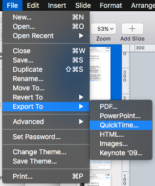
Go to File > Export > Quicktime.
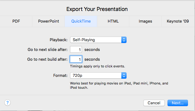
Set the movie to output move to both next slide and build after 1 second. You can output to 720p, but playing with the settings here can give higher quality.
Keynote can also handle video placed in a document, so you can then include your prototype as part of a pitch deck.
You might also want to put the video into some form of post production, like iMovie or After Effects to embellish it somewhat. That’s completely up to you.
Conclusion
And that’s it, you’ve now seen how easy it is to prototype an instant messaging flow in Keynote. Over time, this will become more important as either your company or agency are looking to demonstrate how a conversational flow can work for different interactions.
Apple are due to release iOS 10 in coming months, and with that, brings new messaging functionality. Expect to see the UI elements appear in kits shortly afterwards, and then, prototype your next sticker app or ride hailing integration in the same way. Also, here’s a UI Kit for WeChat, and here’s one that could help you design your own messaging app.
Go and make stuff. And let me know how you get on.
PS - Here’s an amazing roundup of articles about Conversational UI. Fill your boots.